Short answer: Key art is the one base image a campaign is built from, assembled in layers so it can be separated and put back together for every location where the title appears. A poster is one such location. If you ask for a poster, you receive one finished printed sheet at one size. If you ask for key art, you receive the image from which the poster, the banner, the thumbnail, and the packaging are all cut.
The confusion results in real monetary loss and becomes apparent only later. A production orders "a poster", signs off on it, and then learns that the streaming platform requires a horizontal version, the cinema chain needs a different crop, the social team wants a square, and the title lettering must be removed for one territory. None of those adjustments is possible from a flat file. The layers no longer exist.
Key art is a source file, not a finished piece
A poster, once finished, is an output. Outputs are made from key art.
The platforms offer the clearest published description, since they are the ones who must rebuild the image. In its content partner asset guidelines, Netflix describes key art as "a poster, or 'key art', that is used to promote the title in marketing promotions", and then asks for it as a "layered PSD file, meaning all text, logos, characters, and background elements should be separated within the file", supplied at "the highest resolution possible, with no compression" (Netflix content partner asset guidelines).
Text on its own layer, logos on theirs, characters on theirs, background on its own. The platform is describing a kit of parts.
What the platform does with the file after you approve it
Approval is not where the image ends. One line in the guidelines states this: "we will not always include the Key Art on the product even if you provide it to us."
What a Netflix member sees as artwork is usually not the file the distributor delivered. Netflix works through Non-Branded Product Artwork Agencies, whose regional lists are published for ten territories including Canada, and it builds the artwork suite from the source material it is given. Netflix builds that suite to a template named the Universal Base Asset, or UBA, "a flexible artwork template that can easily fulfill any of our on-service product canvases across TV, web and mobile". Two versions exist, horizontal and square, and the horizontal one is used more often (Netflix content partner asset guidelines).
If an image provided does not match the template, those same guidelines state that the agencies "may extend the background of these images, while ensuring that all background extensions are authentic to the environment and context of the content."
This is a matter of control. If the file comes in flat, someone who was not in the room when the image was designed creates the extra sky and the extra street. If it comes in layers, the environment remains with the people who built it. No matter who ends up doing it, making a painted world larger so the seam does not show is digital matte painting.
Composing for a crop nobody has seen yet
The same document states without ambiguity what survives that process: "We find the best UBA suitable images are those of the highest quality and where most of the action is happening in the center of the frame. Talent is usually clearly visible and not cropped too tightly."
It also makes its own rejections public. For one asset based on a film's promotional artwork, the site says the subject's face "will be obscured in most of our canvases since it is not within the safe area", and decides that "the intended crop from the Key Art did not translate well to Product."
That directly conflicts with how a theatrical one sheet is constructed. A one sheet is designed to be seen as a tall whole, with the billing block at the bottom and space for a face placed high and off centre. A platform tile is one crop from a centre-weighted template, and you do not choose which crop. When an image has to do both, it is designed for both from the beginning; later cropping cannot turn it into the second one.
Key art, poster, one sheet, title treatment
People treat four words as interchangeable. They are four distinct deliverables with four different approval paths.
Key art. The source image, composed of layers. It has no dimensions, because its only function is to remain intact when resized.
Poster. A printed sheet at a fixed size, produced from the key art; the billing block, the rating and the release date are set in final form. After printing, it is complete.
One sheet. A movie poster at its usual dimensions. Film Art Gallery, a poster dealer, says in its size guide that until around 1985 the sheet measured 27 by 41 inches, and since then 27 by 40 inches (Film Art Gallery movie poster size guide). That is the item in a lobby lightbox.
Title treatment. The title lettering is designed as a separate piece of artwork. It goes through approval on its own, and it must work at phone tile size as well as on a building. For this reason, it sits on its own layer.
When a production requests "a poster" and receives nothing more, it has bought one item from this group of four and will soon need the remaining three.
Who commissions it, and when in the schedule
The visual effects side is rarely the source of key art. Usually, the party that owns the marketing of the title commissions it: the distributor's creative group, the platform's own team, a campaign agency, or the producers themselves on a smaller film. Its budget is separate from the shots budget, and it answers to different people.
People find the timing surprising. Teaser art must often be produced while shooting is still underway or during early post-production, so when the image is due there may be no finished frame to work from, no final grade, and no locked cut. Treating key art as something to be delivered after post-production is a common scheduling mistake, because the campaign has usually already had to start by the time the film reaches its own final look.
Approval comes next, and it takes longer than the making. Cast likeness approvals, financier notes and platform sign-off all stand in the way.
A formal step also exists for a United States theatrical release. The CARA Advertising Administration evaluates and approves "every single piece of advertising and marketing material for every movie that is rated by CARA. This includes teasers, trailers, posters, billboards, signage on public transportation, social media ads, social media filters" (MPA film ratings, resources and FAQ). Schedule the review rounds. If an image must be changed after approval, the change is cheap in layers and expensive when flat.
What a campaign actually asks for
Give a supplier a list of required outputs instead of a description of the picture. Check every line below with the people who will actually use the file.
- A master file with layers at print resolution, arranged so the subject, environment, text and logos can each be moved.
- A version without text that leaves out the title, the billing block and the dates, allowing other territories and other placements to be produced from it.
- Space in the composition for a crop toward the centre, not only for the poster's current shape.
- The title treatment as a separate vector file, with the font names identified.
- Clear space included in the design, not added later by cropping, for the billing block, the rating card, the logo band and any platform furniture.
- A defined colour pipeline for anything that is printed.
For two of those lines, published specifications exist. Netflix asks for the title treatment as an AI, EPS or PDF; accepts a raster version only if it is wider than 2500 pixels and contains no other elements; requests the font names; and cautions against low contrast, thin font weight, drop shadows and long character spacing, all of which make a title unreadable at tile size (Netflix content partner asset guidelines).
With respect to colour, the International Color Consortium, which describes its purpose as "to promote the use and adoption of open, vendor-neutral, cross-platform color management systems" (color.org), issues the profile format used to carry a colour from a display to a press. Ask the printer which profile they will use for the run before painting begins, not at the proof stage.
Why can't we just use a frame from the film?
There are times when you can, and when the shot is correct, it is the least expensive option. More often, three things interfere.
Resolution comes first, and it is nothing but arithmetic. Most print work is prepared at around 300 dots per inch, so a one sheet 27 inches wide requires close to 8,000 pixels across. A master graded for a television screen holds only a fraction of that, and enlarging it cannot create detail that was never captured. Before anyone promises a poster from it, ask what the source's actual pixel dimensions are.
The second is shape. A frame is designed for a wide screen, while a poster is usually taller than it is wide. When you crop a horizontal composition into a vertical one, you cut away the part of the frame that made it work.
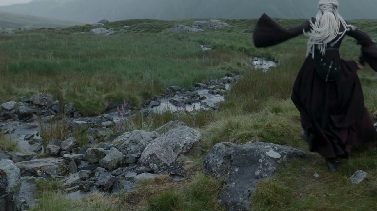
Intent comes third, and it is the one that truly decides the result. Filmmakers light and stage a shot so that it carries a moment inside the larger sequence. Key art has no such surrounding sequence. In one look, it has to communicate the kind of story, the setting, and what is at stake, from an angle the camera may never have taken and at a moment that never took place as a single event. That is why key art is usually illustrated, painted, or assembled from separate pieces rather than photographed as one scene: the picture being promoted is often not a picture any camera could have captured.
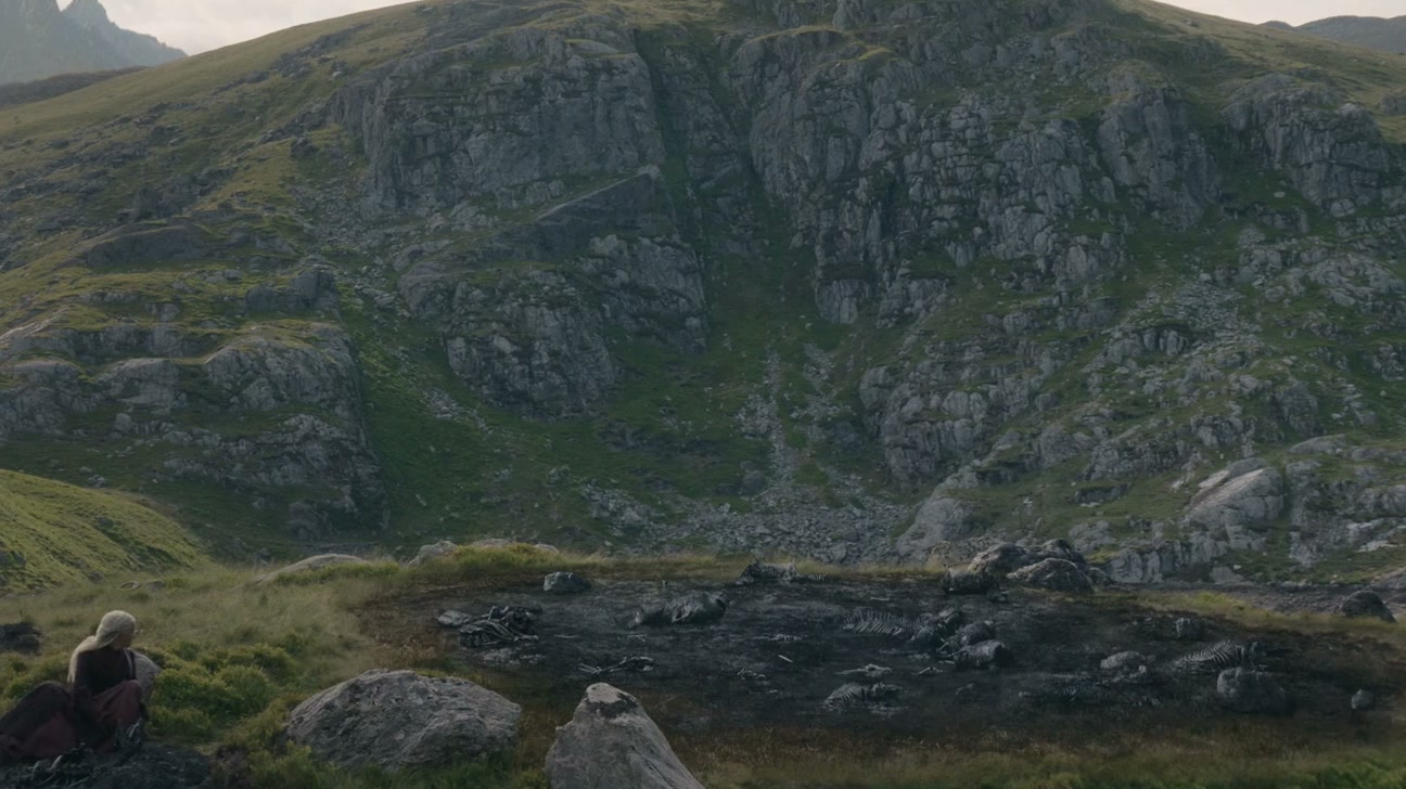
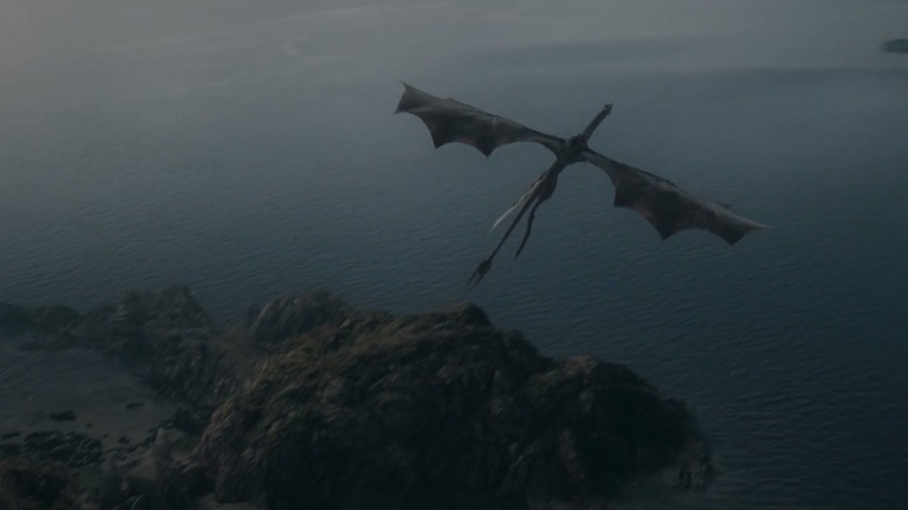
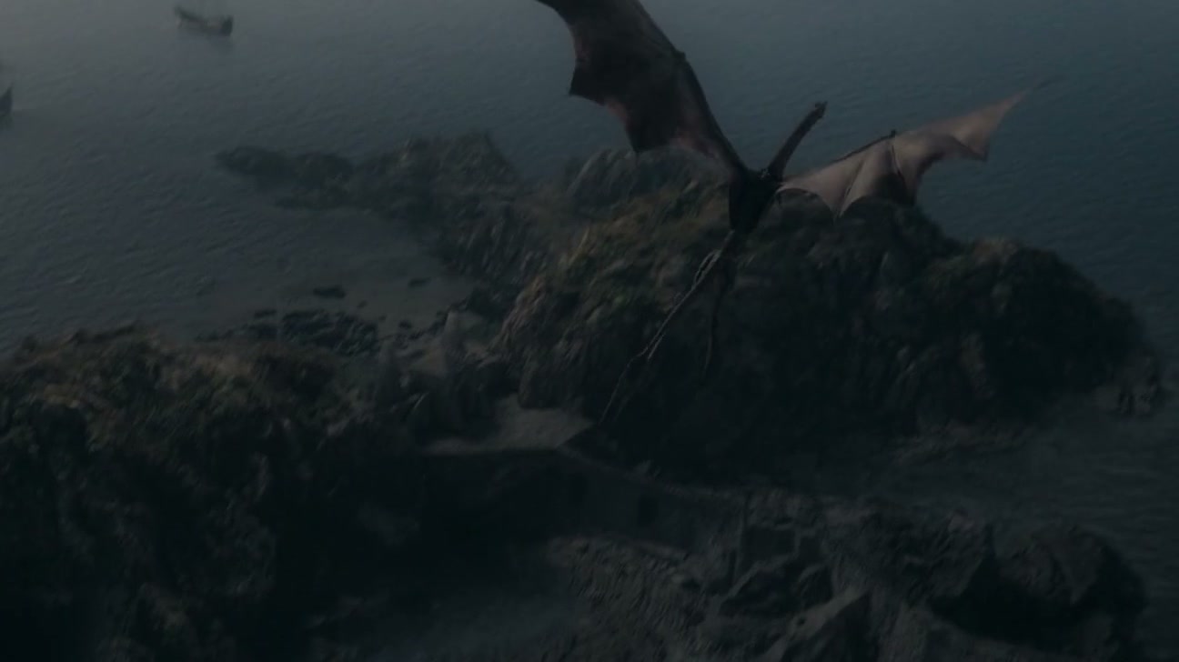
Most of that meaning comes from the environment behind the subject. One look reads as a thriller and another as a period drama because of the hour, the weather, the scale of the place next to a person, and the amount of sky. When the world is assembled from photography and paint, the craft is digital matte painting; when the whole frame is drawn, it is digital illustration.
Where CG box art fits
Packaging artwork for a physical product carries the same task on a different shelf, so it deserves a place in the same discussion as key art for film and television. From two metres away, a person gets one image to convey what the object is and what it did before they read a single word of the package.
The difference lies in the subject. A buyer who puts together a model kit compares panel lines, markings and proportions with familiar references, so the subject is assembled and depicted rather than interpreted, and the judgement moves to everything around it: the altitude, the weather, the time of an actual mission. That approach is explained on the CG box art and key art page.
The other difference involves print. The colour question carries more weight, and the crop must withstand anything that lands on it: a logo band, a barcode, a die-cut edge.
If you are about to commission one
Before anything else, settle what the image must deliver, not how it should look. A campaign that sets its required outputs before work begins gets an image that holds up when cut into pieces. One that approves a picture and figures out placements after the fact will have to redo it.
In Toronto, Chumak Studio produces painted settings for film and television. If you have a title and are unsure what the campaign actually needs as deliverables, send the brief and you will get a clear answer about what the list should include.